Arial is Not a Font
May 18, 2010 at 12:01 am Chad Upton 6 comments
Arial is a typeface (aka “font family”). In fact, what many people refer to as “fonts” are actually “typefaces.”
The meaning of the word “font” has been butchered since the introduction of desktop publishing in the mid 1980s.
 What is the true meaning? Directly from Wikipedia, “… a complete character set of a single size and style of a particular typeface.”
In other words, a font is a specific version of a typeface. Arial is a typeface, and 12-point Arial Italic is a font. 14-point Arial Italic is a different font in the Arial font family.
Changing the size of text on a computer is not a significant amount of work, so it might seem silly to think that you’re actually changing the font when you do this. Especially since we think of the font as just the typeface and not its size or style. But, this terminology made a lot of sense before desktop publishing.
The first printing presses used characters that were carved from wood and arranged in order to form a complete sentence, although they were glyphs rather than Latin characters.
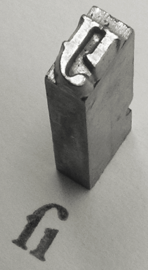
This evolved into more modern systems that used metal characters that were more durable. At that time, changing the size of a typeface was a lot of work — it meant you had to pull all of the letters out and reassemble the words with a different set of metal pieces.
It was very expensive for a printer to have multiple styles and sizes of characters available for their press. When a printer bought a new font they would specifically order the typeface (Times, Arial…etc), size (10-point, 12-point…etc) and style (bold, italic…etc).
There was two drawer case for storing each font. The capital letters were in the upper drawer and the other characters were in the lower drawer. That’s why we call them “upper case” and “lower case” letters.
Broken Secrets | By: Chad Upton
Sources (Wikipedia links): Typeface, Font, Desktop Publishing, Movable Type,
Image: Wikipedia
Entry filed under: Computers and Internet, Despite Popular Belief, Geek. Tags: arial, bold, font, garamond, italic, oblique, times, typeface.
6 Comments Add your own
Leave a comment
Trackback this post | Subscribe to the comments via RSS Feed


1. Cole | May 18, 2010 at 2:16 am
I don’t know, I kinda think that once a word has been used a certain way for nearly 30 years, it’s okay to change the definition a bit.. But, the history is interesting
2. Maya | May 18, 2010 at 10:49 am
I really liked this secret – especially the upper and lower case part. Thanks for sharing this :)
3. Mike | June 8, 2010 at 10:25 am
The first printing presses used characters that were carved from wood and arranged in order to from a complete sentence, although they were glyphs rather than Latin characters.
Try
“Form a complete sentence”
4. Chad Upton | June 8, 2010 at 10:28 am
Thanks! Good catch.
5. quidquid quidquid | July 14, 2010 at 6:14 pm
I am in the publishing industry and I am embarrassed to say that I did not know the distinction–although it makes sense!
6. Chris Ray | September 2, 2011 at 6:41 pm
Brilliant! Love learning things that should be rather well known yet somehow slipped out of history all together! Course nowadays because of the times even having the word typeface has become rather redundant and pointless, thus the changing of the word “font” to mean both font and typeface.