By Chad Upton | Editor
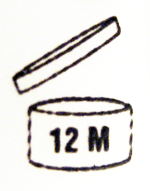 Finding the shelf life or expiry date on something in your fridge can be challenging. It’s much easier to find the product life on personal items like shampoo, mouthwash, body wash, cosmetics, etc. You won’t find it on all products of this type in North America, but it is a requirement in Europe so you will see it on many products that share global packaging.
The “Period After Opening Symbol” is a standard icon that indicates how many months (M) or years (Y) the product is good after opening. The product must remain harmless to its user within this period.
Now, you just have to remember when you opened it.
Broken Secrets | Facebook | Twitter | Email | Kindle
Sources: wikipedia (PAOS)
March 31, 2012 at 11:30 pm Chad Upton
By Kaye Nemec
Northface is a performance apparel, equipment and footwear company that started over 40 years ago. Although most of their products are geared towards mountaineers, climbers and hikers, the company was, ironically, started on a beach. In 1966 two young men with a passion for hiking were living in San Francisco’s North Beach neighborhood; they decided to turn their hobby into a living by starting a small, mountaineering retail business. Today, they are known around the world as a leader in endurance products among outdoor performance enthusiasts.
The name North Face was chosen because the north face of a mountain is the coldest and most treacherous side and the goal was to create gear that would assist climbers in successfully traversing these conditions.

The logo they chose for the The North Face company is an interpretation of Yosemite National Park’s Half Dome, a rock formation rising 8,800 feet above sea level. In 1865 Half Dome was declaredto be completely inaccessible to anyone and this was believed to be true until 1875 when George Anderson was the first person to successfully reach the summit.
Today thousands of people reach the summit every year and several of them are likely using North Face gear while they do it.
Broken Secrets
Subscribe on: Facebook | Twitter | Email | Kindle
Sources: The North Face: Our Story, Dinesh.com, NPS.gov
December 15, 2010 at 2:00 am Broken Secrets
By Chad Upton | Editor
A well designed logo is simple, easy to identify and conveys important information about the brand it represents.
Some logos do that by looking the part: cool, stylish, funky, formal, casual…etc. Logos may also represent the brand with meaningful imagery.
Although you may have seen these logos hundreds of times, you may have have missed some of the meaning.
Apple

With the cachet of this brand, it’s hard to believe it was nearly bankrupt ten years ago. Now, it’s one of the most valuable consumer electronics brands.
There are many stories floating around about how the Apple logo got its bite mark (or “byte” mark). The ad agency that created it, claims it is a biblical reference that symbolizes a bite from the forbidden fruit from the tree of knowledge. In the story, a serpent promises Eve that eating the fruit would make one wise.

BMW
Bayerische Motoren Werke (BMW) originally made airplane engines and there is a popular theory that the logo shape represents a spinning airplane propeller. Although that makes a lot of sense, the design is actually based on the colors of the checkered Bavarian flag, the German State where the automaker started.
Fedex

See the arrow between the “E” and the “x”?
Toblerone

Look at the white space in the mountain. It’s a bear, a symbol of the town where Toblerone started.
Tostitos

Two of the letters are sharing a Tostito and a bowl of salsa, which happens to be the dot on the “i.” That’s a legal double dip.
Baskin Robbins

They have 31 flavors and the number is right in the logo.
Milwaukee Brewers

In the old Milwaukee Brewers logo, the letters “m” and “b” form a baseball glove.
Cisco

You may not have seen cisco’s products, but chances are good that some of them are responsible for letting you view this web page — they make telecommunications equipment. The company was named after the city of San Francisco. The waveform bars in the logo represent the Golden Gate Bridge, a well known San Francisco landmark.
Sun Microsystems

The letters “U” and “N” are arranged to create the letter “S”, spelling “sun.”
Amazon

They have everything, from A to Z.
Broken Secrets
Subscribe on: Facebook | Twitter | Kindle
Sources: Logo Blog, Wikipedia (Apple Logo), Kelly Advertising, Wallet Pop, CorporateLogos.ws, NY Times
August 27, 2010 at 1:10 am Chad Upton
 Finding the shelf life or expiry date on something in your fridge can be challenging. It’s much easier to find the product life on personal items like shampoo, mouthwash, body wash, cosmetics, etc. You won’t find it on all products of this type in North America, but it is a requirement in Europe so you will see it on many products that share global packaging.